Sigma Delta without Math – Part 1 – 2021-11-10
If, like me, you’ve been curious about the best way to get good quality audio out of an FPGA, but found that all search avenues lead to impenetrable diagrams with lots of arrows, accumulators and terms like [1/z^-1] then this series is for you!
I wrote recently about the hybrid PWM / Sigma Delta DAC which I created some years ago, and how I’d never really understood why it worked better than alternatives, even though I could demonstrate that it did.
It was still far from perfect, however – and still suffers from idle tones if the input level gets too low.
I mentioned before that my background is in graphics, so I readily drew parallels between different types of audio DAC operating in one dimension and the halftone patterns used in printing – operating in two dimensions. In both cases we typically have two output levels available, which must be modulated to give the impression that more are available.
Take, for example, a simple gradient:

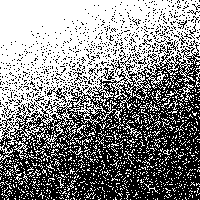
Imagine printing this on a printer which can either produce a dot, or not produce a dot, but with no middle ground. For each pixel we apply a strict threshold function which maps it either to black or to white. (For the following illustrations, pixel values are taken to be in the range 0 to 1, and the threshold is 0.5):

That’s… not a particularly faithful reproduction.
So how can we improve upon this? Depending upon your background, you’ll probably be thinking of the words “screen”, “halftone” or “dither” at this point – but whichever term springs to mind, what we’re actually talking about is modulating the original image in some way before applying the threshold function.
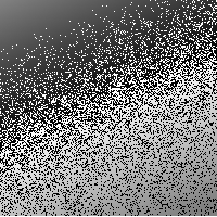
To demonstrate what I mean, imagine that for each pixel we generate a random number between about 0.7 and -0.7, and add this number to each pixel’s value before applying the threshold: (I’ve created this illustration using GIMP’s “hurl” plugin, so the range of random values is approximate.)
That’s actually surprisingly good bearing in mind all we’ve done is add noise! Noise is bad, so how can more of it be a good thing?
Well, let’s take a closer look at this noise, by comparing each image with the original. I’ve done this using GIMP’s “Grain Extract” layer mode. The result is mid grey where there’s no difference, white when the difference is positive maximum, and black when the difference is negative maximum.
Here’s what we see if we compare the simple threshold version with the original:

We have a massive and very energetic jump in error along that diagonal line. Now let’s compare the random dithered version with the original:
So that’s interesting. There’s probably more error overall, but because it’s distributed over most of the image, instead of being concentrated near the middle, and doesn’t exhibit that neatly-aligned cliff-edge jump from one extreme to the other, it’s less objectionable to the eye.
The takeaway here is that “noise” and “objectionable noise” are not the same thing, and more of the former can equate to less of the latter.
In the lithographic printing world it was realised early on that human vision is far from perfect, and it’s possible to print features which are not individually discernible when an image is viewed as a whole. It has been common practice for decades to print shades of grey using regularly spaced patterns of dots. When viewed from a distance of more than few inches the eye can no longer make out the individual dots, and instead perceives a shade of grey, the darkness of which depends on the size of the dots. (Side note – I’m near-sighted, so if I remove my glasses I can just see the dots of a 175-lines-per-inch dot screen without magnification – but I have to hold the page very close!)
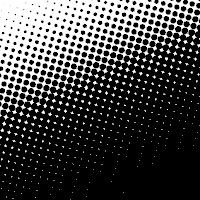
Originally this was done optically by overlaying semi-transparent “screens” over a photographic print when producing the film used for platemaking. With the advent of Postscript and imagesetters – and then ultimately platesetters – this photographic process was replaced with digital screens. The principle is exactly the same as outlined earlier, however – the continuous-tone image is being modulated before a threshold function is applied. Instead of just splattering random numbers over the image, the modulation in this case involves a matrix of numbers which is tiled over the entire image. The numbers in this matrix are arranged in a neat spiral pattern so as they’re added to progressively higher input values the threshold function results in a larger and larger dot. (Generally there’s some rotation as well, which allows multiple colours to be overlaid without moiré patterns developing.) The traditional dot screen looks something like this:
And when compared with the original continuous tone image, we get this:

Once again, significantly more noise than the first case, but significantly less objectionable noise. If you stand the other side of the room and squint, it almost looks smooth!
So what does all this have to do with Sigma Delta modulators, and producing high quality audio on an FPGA? All will be explained in part 2!